What is UI/UX?
UI and UX are often mistaken and confused in terms of web design and development since they are often placed together in a single term, UI/UX. However, UI stands for user interface which is all the graphical elements and layout of the app and UX stands for user experience which is the interaction between the user and the application.
User experience is often determined by how easy or difficult it is for the user to interact with the design that was developed. While the user interface is often determined by the feel, visual appeal, and the theme of the app, is the design appropriate? Or does it lack in a visual element, all the visual elements should be in sync, visually, and functionally.
UI/UX is essential. Period. Even if you have a good website without of the world functions implemented, if you don’t have a good User Interface and User Experience, no one would bother exploring the site enough to experience them.
Think about the recent websites you have visited. Do you recall any of them being overly amazing? Or perhaps some of them provide you with an experience of less than subpar.
Today we will be introducing you to the rules of creating a good UI/UX design!
WHAT MAKES A GOOD UI/UX DESIGN?
Firstly, make everything the user needs readily accessible.
Have you ever been to a site for a specific reason just to end up being lost? For example, trying to check your shipping order for updates, but upon arriving at the homepage of the shipping company, you are greeted with over 10 different buttons and tabs that lead to everywhere but tracking your order. Feel frustrated? Exactly.
In UI/UX design, we aim to make things easier to access, to improve the user experience. Put yourself in the shoes of your user. Think about how you would feel if you design the website in such a particular way and work your way up from there.
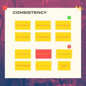
Secondly, be consistent.
Consistency is yet another rule that should always be enforced. Being consistent means using a standard set of colors for the site, or using the same set of fonts throughout the website. If you create a font for a button, keep the fonts of all buttons to the same one. If you saw buttons of different shapes and sizes all mish-mashed together, how would you feel? Funny? Probably. Annoyed? Definitely.
Third, Be clear.
Get straight to the point. Don’t make the user wonder about the website not knowing what to do. Make sure that buttons go where they intend to go and make instructions clear cut. One confused user is one less potential customer. Being able to navigate across a website easily is a key factor in enhancing the user experience. The website should assist the user in getting what he/she wants, not encumber them.
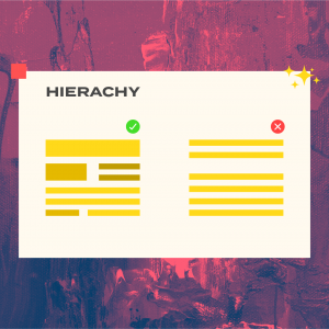
Fourth, Elemental hierarchy matters
Prioritizing content within the visual hierarchy is very essential because when designing an interface with any amount of information, there has to be content, both visually and contextually. These must be organized to provide the best user experience. Leave the most important functions at the top of their respective pages.
Make use of spacing. Keep different parts of content in their own sections. Cluttering of content can stall user progress and draw the attention away from the purpose of the page.
Lastly, Follow design standards
Not so much on the design and look of the application but functions that are already the norm. People know that question marks indicate help, so don’t go using the exclamation mark instead. Think search bars, they are usually at the top of the screen on most sites. If you place it in some hard to find bottom corner of the screen, users might not know where to look. There’s no harm in thinking outside of the box, but that doesn’t mean it should be hard to use.
ALL SET!
Now that you got the basics down, you will never see websites in the same way again ?. You’ll notice the little things that set apart great websites from the massive ocean that is the internet. Have a good day!