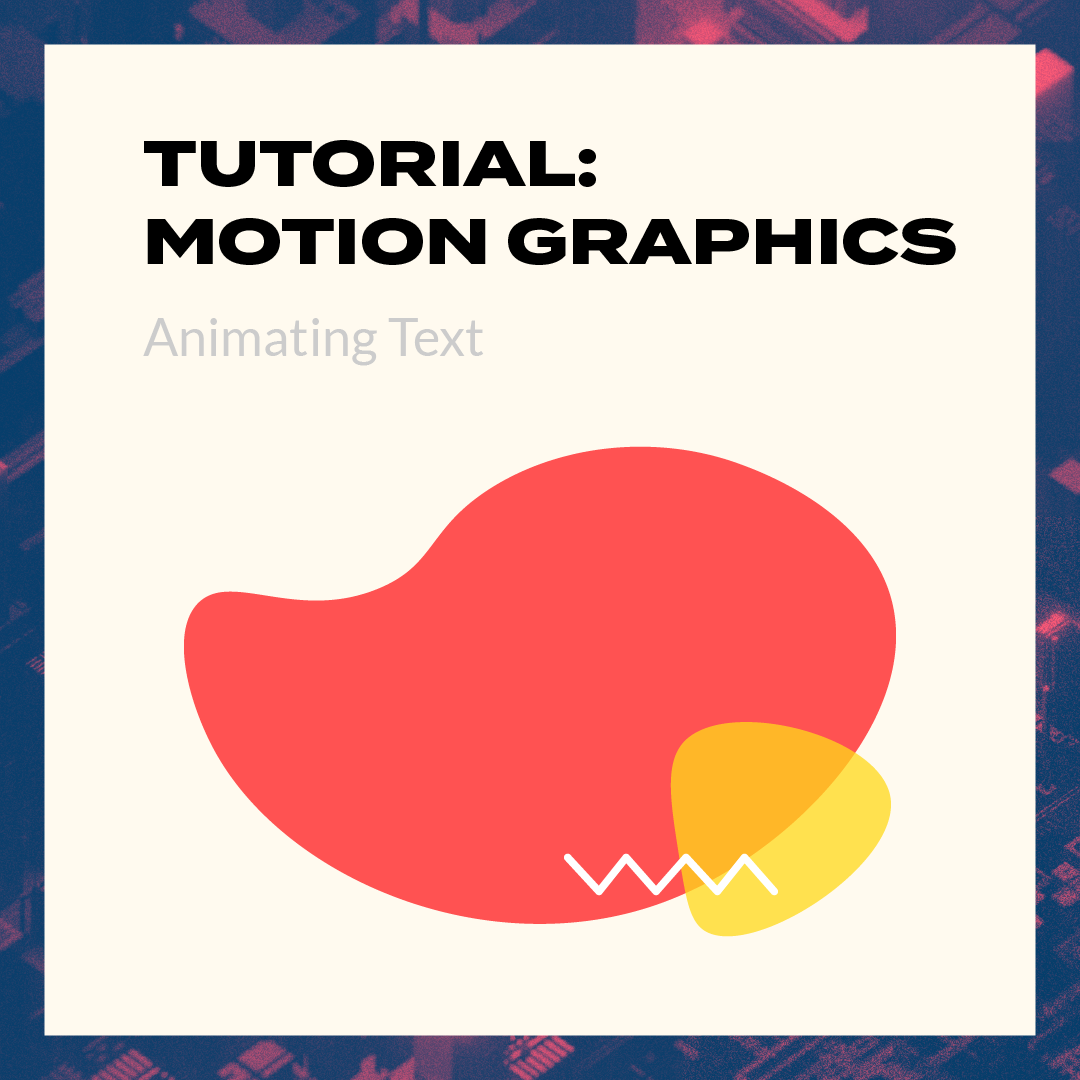
In a surprising twist, we’ve decided to have one more educational post, which means one more Instagram Post, and one more article! This time, it’s on something that we all see, but has a lot more to it than we expect: Typography! We believe that this is similar to our past two topics of “Colour Psychology” and “Programming Languages”, in which they were topics that were close to our heart and we believed in. However, for this typography guide, we wanted to change it up a little, in which we wanted to focus on the mistakes that we’d make a lot of the time, and show how to fix these mistakes.
Identifying the Mistakes
There was an entire ocean of mistakes we could choose from (we’re not joking), but that wouldn’t fit in a 10-page carousel.
However, we still have to give you a show. Hence, we settled on 3 common typography mistakes, which are Poor Hierarchy, Not using Typefaces with various weights, and creating paragraphs with jagged edges.
Hierarchal Matters
Starting off the typography guide, is Poor hierarchy. A lot of people tend to underestimate the power of hierarchy within typography. When done right, you can control where you want the viewer to look first. That is an incredibly powerful tool to have and a must-leverage to bring out the best from your content.
The common typography mistakes that we’ve made before are the font size between the title and the paragraph wasn’t large enough.
As a result, there would be no visual separation between different segments which would cause the headline to blend into the paragraph.
The entire thing would be viewed as 1 element, which is not what we want.
To counter this, we have to use font sizes that are a step higher than our ‘base’ font size. Then when creating a headline, we used this stepped up font size, creating the distinction between headline and body text.
It might be hard at first to decide how much of a step up to use, so we’re providing a link to a website tool that helps you to determine what font sizes to use.
It’s at type-scale.com, and it just requires you to input the type of step up, and the base font size you’ll be using, and type-scale will do the rest.
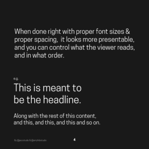
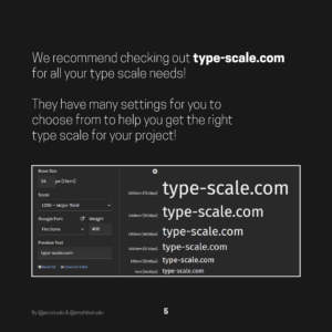
Example of Font size providing hierarchy, along with showcasing type-scale.com, direct from our Instagram post at @amphibistudio!
Leveraging Various Weights
The next problem we would like to spotlighted in this typography guide, is not leveraging typefaces with various weights.
While distinction can be made with just different font sizes, there comes an extent where the font gets too large. In turn making the distinction no longer a presentable one. That’s where font weights come in. Font weights increase the thickness of the text, which makes them stand out more the thicker they are.
A good practice is to skip a weight when using multiple font weights in your design. If you start off with a regular weight, you would use a Light weight for the thinner font and skip straight to Bold for a thicker font.
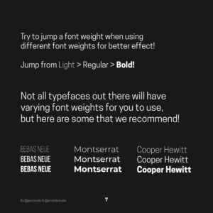
Examples of having differing font weights!
Smoothing Out the Edges
The last typography mistake is on paragraphs having “uneven edges”. This one is not something that’s noticed often, but it does make a difference in the overall look of a body of text. It happens when words on the end of a line are jutting out into space. This makes the paragraph look messier, less inviting, and overall less pleasing to the eye.
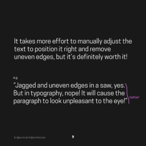
It does definitely take time to manually do the adjustments like bumping words up or down in order to smooth out the edges of the paragraph. But take our word for it, it makes the paragraph look so much better.
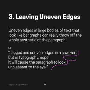
(Uneven edges, oh no)
Beyond the three
There are a lot more mistakes than what we’ve covered. However, it would definitely not fit in a 10-page carousel. Moreover, this typography guide would get way too long. Hence, here’s one more that we’d like to share here!
Ignoring Content context. While a said font might be great, good readability, it might not fit the context of what you’re creating. Think of it like this, if it were for an article on the web like on Medium, it would be slightly professional.
Being somewhat like a blog post, it has to be readable. Thus, we would go for a sans serif font to write our body text. If it were a cursive or serif font, it would have been a lot harder to read. This is because some serifs are still very legible. Hence, it does take time and effort to know what is the right typography to use for a body text.
However, there are times where a serif or cursive font would take the cake over a sans serif option. For instance, stylized products like a birthday card, or an invitation letter. But still in that scenario, it’s because of the context. Thus, the alternative choice is able to work.
The art of typography is a very delicate one, major kudos to the artists that have taken the time to perfect the craft that is Typography.
And with that, that’s our last educational post and article (we promise ><). If you’ve stuck around for all three posts and articles, we really appreciate it and we thank all of you